This essay will discuss the life of Jules Chéret in the first part, then it will discuss some of his main principles on his design, and finally I would compare him with Henri de Toulouse-Lautrec and Czech artist Alphonse Mucha.
 |
| Image 1 |
 | |
| Image 2 |
The three greatest poster artists from the end of 19th century and the beginning of 20th century are for me Jules Chéret, Henri de Toulouse-Lautrec and Czech artist Alphonse Mucha. Because they were contemporaries and they lived in similar society, they have a lot in common. First I would compare Chéret's and Mucha's artworks, and then I would be focused on the comparison between Chéret's and Lautrec's works.
 For the first comparison I've picked Chéret's Aux Buttes Chaumont (image 3) and Mucha's Champagne Label (image 4). As the first point, I would point out, that my intention was to pick the same size of the canvas for the better comparison. The biggest similarity I am looking at is the composition. Both of these atrworks has the same position of typography. While Chéret used modern look of typography, and very huge contrast in comparison with the background, Mucha stayed with his traditional typography. The next point is the main element of the composition. While Chéret used to have a lot of people, animals or other things on one composition in the middle, Mucha used to have mostly one ot two woman, for me, as a exteriorization of a beauty. The color palette they were both using is different from artwork to artwork, but overall Chéret was using a lot more wide, vivid and vibrant colours than Mucha. This is also the thing, why is Mucha's art for me so valuable and why I like it. It looks perfectly clean, it is very elegant, tasteful and moreover I like the symmetrical balance in his artworks.
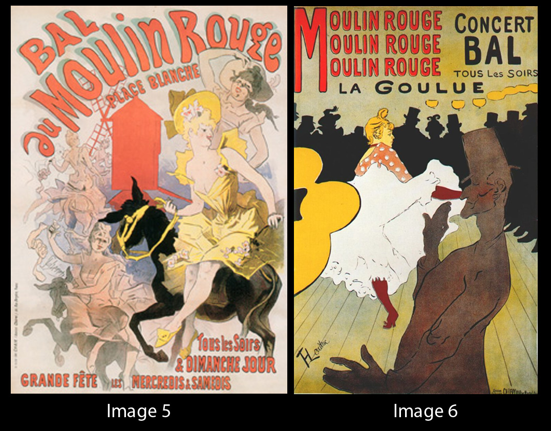
The second Chéret's important contemporary was Henri de Toulouse-Lautrec. For comparison, I had deliberately chosen two posters, which are based on the same topics- Moulin Rouge. As Cheret.info (2004) points out "Chéret fused modernity, innovation, established artistic quality, and commercial effectiveness in a mixture guaranteed to attract Paris’ attention utilizing the background of the Moulin Rouge." Both of these two artist were using a lot movements, beautiful woman, expressions and noisy mood. Their colour palette is very similar on these artworks and it is interesting to point out, that both of them had chosen red colour for the headline Moulin Rouge. In my opinion, the reason being is briskness, jocundity and dynamics of this club.
In conclusion, Jules Chéret was a great artist, who designed a lot of beautiful posters. If I am looking at his lively characters from the posters, I feel the mood of that time, in addition I hear "noise music" and audible noise from the clubs, performances or the theatres, which creates unforgettable art from me.
References:
Bell, D., Hollows, J. (2006) Historicizing Lifestyle: Mediating Taste, Consumption and Identity from the 1900s to 1970s. USA: Ashgate Publishing Company
Broido, L. (1992) The Posters of Jules Chéret: 46 full-color plates & an illustrated catalogue Raisonné. 2nd edn. Canada: General Publishing company
Cheret.info (2004) Cheret's Artistic Style [Online]. Available at: http://www.cheret.info/jules_cheret_artistic_style.html (Accessed: 29 March 2011).
Petterson, R. (2002) Information Design. An introduction. USA: John Benjamins Publishing Company
Wetcanvas (1998) Jules Chéret [Online]. Available at: http://www.wetcanvas.com/Museum/Artists/c/Jules_Cheret/index.html (Accessed: 29 March 2011).
List of visuals:
- Images:
Image 1: Jean-Marc Fray (2009) Jules Chéret [Online]. Available at: http://frenchantiques.blogspot.com/2010/09/jules-cheret-modern-renaissance-man.html (Accessed: 29 March 2011).
Image 2: Wowcoolstuff (2011) Exposition Universelle des Arts Incoherents [Online]. Available at: http://www.wowcoolstuff.com/Exposition-Universelle-des-Arts-Incoherents_p_96283.html (Accessed: 29 March 2011).
Image 3: (1899) Aux Buttes Chaumont [Online]. Available at: http://www.yaneff.com/html/plates/pl185.html (Accessed: 29 March 2011).
Image 4: Joieart (2009) Champagne Label [Online]. Available at: http://www.joieart.net/2009/02/alphonse-mucha-artist-spotlight/ (Accessed: 29 March 2011).
Image 5: Chéret, J. (1889) Ball au Moulin Rouge [Online]. Available at: http://frenchantiques.blogspot.com/2010/09/jules-cheret-modern-renaissance-man.html (Accessed: 29 March 2011).
Image 6: Lautrec, T. (1891) Le Moulin Rouge [Online]. Available at: http://www.leboudoirdumarais.com/wp-content/uploads/2009/09/3-Lautrec_moulin_rouge_la_goulue_poster_1891.jpg (Accessed: 29 March 2011).
Research:
- 1836 -1932
- French lithographer, designer, painter
- Father of the modern poster
- Art-Noveau
- He introduced a new system of printing from three stones
- His work showed delicate, powdery, and graceful fluidity of pastel
- "theory of complementary colors"
- Cheret painted the iconic "Cherettes" and he was famous for these light-footed beauties
In 1858 Cheret created his first poster for the composer Jacques Offenbach and when this did not lead to further commissions, he once again returned to London to try his hand a second time. Determined to continue his work as an artist, he designed book covers for the publishing firm of Cramer as well as several posters for the circus, theater, music halls, actresses and cabarets as well as products. Such advertisements were of a new kind, and these innovative and artistic efforts led him to the next phase of his work.
http://www.cheret.info/jules_cheret_early_works.htmlWhile doing these posters Jules Cheret executed numerous pastels and watercolors. His ‘Cherettes’, the lovely and lively women who could be seen dancing, playing cymbals or mandolins, dressed in the fashion of the day were a popular subject. His ability to strike a balance between the reality and fantasy of colors was unsurpassed, and to this day Jules Cheret is considered the “Master of Lithography.”
http://www.phylliselliottgallery.com/jules_cheret.htmlCheret became known for his popular bright orange, blue and green music hall posters. He realized a poster did not have to show product; it merely had to produce "a reaction of amusement, curiosity, excitement or some positive feeling which will help make the right points,'' as Harold Hutchinson writes in "The Poster: An Illustrated History From 1860'' (Viking). Hutchinson notes that by 1880 Cheret was so good at his craft that a Paris art critic wrote, ``there was a thousand times more talent in the smallest of Cheret's posters than in the majority of the pictures on the walls of the Paris Salon.''
A century ago, Barclay said, "every wall in Paris was rented out for posters, so the government had to pass a law restricting bill posting to specific areas.''
In 1881, a law was passed which created official "posting places", and an entire industry was created. Every poster required a tax stamp to indicate that a fee had been paid for the right to post it. Based on square footage, the tax led to the adoption of standard sizes. Advertisers worked with artists, printers and posting companies to create, post and maintain the poster on the street.
http://www.wetcanvas.com/Museum/Artists/c/Jules_Cheret/index.html
Born in Paris to a poor but creative family of artisans, a lack of finances meant Jules Cheret had a very limited education. At age thirteen, he began a three-year apprenticeship with a lithographer and then his interest in painting led him to take an art course at the École Nationale de Dessin.
http://www.jules-cheret.org/
"The Father of the Poster" He revolutionized the field of advertising by his contributions in design and printing techniques. He designed over 1000 posters. The true Poster Master.
http://www.yaneff.com/html/artists/cheret.html
Owning his own firm allowed Chéret to maintain artistic control and to establish an innovative design approach. Most lithographers of the time commissioned an artist to create a poster design, which was then copied onto a stone by a skilled craftsman. Chéret, however, worked directly on the stone, using spirited brush lines, crosshatch, stipple, soft watercolour-like washes, and areas of flat colour to create a dynamic image. Throughout the 1870s and ’80s, his style evolved from one typical of Victorian graphics, that is, dominated by complex decoration, to a simpler, more dynamic approach in which compositions were dominated by large central figures, prominent hand-lettered titles, simplified backgrounds, and large areas of glowing colour and gestural textures. His artistic influences included the idyllic romances of the Rococo painters Antoine Watteau and Jean-Honoré Fragonard, the churning compositions of Baroque painter Giovanni Battista Tiepolo, and the flat colour and stylized linear contours of Japanese woodblock prints.
Books:
http://site.ebrary.com/lib/pcollege/docDetail.action?docID=10211015&p00=ch%C3%A9ret
http://site.ebrary.com/lib/pcollege/docDetail.action?docID=10023492&p00=ch%C3%A9ret
Posters:


